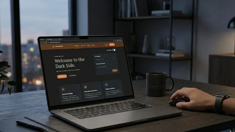
We’re Going Dark (For All the Right Reasons)
Have you ever opened your phone in a dark room and felt like you were staring directly into a high-powered flashlight? That sudden, stinging brightness is a common digital experience, but it’s quickly becoming a thing of the past. As we spend more of our lives behind screens, the way we design those screens has to change. We have to ask ourselves: Is the traditional “black text on a white background” really the best way to consume information? Or is there a more comfortable, efficient, and stylish way to browse?
The answer, for many, is found in the shadows. We are seeing a massive shift in web design. Dark mode is no longer just a “cool feature” for gamers or coders. It has become a fundamental expectation for the modern user. By switching to a darker interface, we aren’t just following a trend. We are prioritizing the health of your eyes, the life of your battery, and the clarity of our message.
Why Does a Bright Screen Hurt?
To understand why dark mode is so popular, we first have to look at the biology of the human eye. Most of us spend upwards of seven hours a day looking at digital displays. When those displays are primarily white, they emit a significant amount of light. This constant brightness forces the pupils to remain constricted, which can lead to muscle fatigue over time.
Have you noticed your eyes feeling dry or itchy after a long day at the office? You aren’t alone. According to The Vision Council,
According to The Vision Council, more than 80% of American adults report using digital devices for more than 2 hours per day, and a large proportion experience symptoms of digital eye strain.
When we use dark mode, we flip the script. Using light text on a dark background reduces the overall screen luminance. This is especially helpful in low-light environments. Instead of your screen acting as a primary light source that competes with the room, it blends in. This reduces the “halo effect”—that blurry glow that can happen around bright objects on a dark screen—and makes the reading experience much smoother.
Saving More Than Just Your Sight
While the health of your eyes is a top priority, dark mode also offers a practical benefit for your hardware. If you are reading this on a modern smartphone, you likely have an OLED or AMOLED screen. These screens are different from the older LCD screens. In an LCD, the backlight stays on even when the screen shows a black image.
However, with OLED technology, each pixel is its own light source. To show the color black, the pixel simply turns off. It uses zero power. This means that every dark area on your screen is literally saving your battery life.
How much of a difference does it really make?
A study conducted by Purdue University found that switching from light mode to dark mode at 100% brightness can save an average of 39% to 47% of battery power.
Even at lower brightness levels, the savings are significant. By choosing a dark interface, we are helping you stay connected longer without reaching for a charger. This is a small but meaningful way to improve the daily life of every visitor to our site.
The Art of Focus in Web Design
Web design is about more than just making things look “pretty.” It is about guiding the user through a journey. When a website is all white, everything has the same level of visual “loudness.” It can be hard for the eye to know exactly where to land.
Dark mode creates a natural visual hierarchy. Imagine a dark theater. When the lights go down, and the spotlight hits the actor, you know exactly where to look. Dark mode works the same way for web content. By using a deep, dark background, we can make our images, call-to-action buttons, and key headers “pop” with vibrant color.
This reduction in visual noise helps you focus on what actually matters. Whether you’re reading a detailed guide or looking at a data-heavy chart, the dark background helps the information stand out. It creates a sense of depth and sophistication that a white background often lacks. It feels premium, modern, and direct.
Accessibility Is Not Optional
One of the most important reasons for going dark is accessibility. Design should be inclusive. For users with light sensitivity (photophobia) or certain visual impairments, a bright white screen can be physically painful to look at for more than a few seconds.
By providing a dark mode option, we ensure everyone can access our content comfortably.
A poll by Android Authority showed that roughly 90% of users prefer dark mode over light mode when the option is given.
When 9 out of 10 people prefer a specific way to view your site, it is no longer a “preference”—it is a standard.
We believe in giving the user agency. Modern browsers allow us to detect your system settings. If you have your phone or computer set to dark mode, our website will automatically respect that choice. We want to meet you where you are, rather than forcing you to adapt to us.

The Psychology of the Dark Side
There is a certain psychological weight to the color black and deep grays. In the world of branding and web design, dark themes are often associated with power, elegance, and high-tech innovation. Think about the sleek interfaces of premium apps like Spotify or the high-end aesthetic of brands like Apple.
Dark mode feels stealthy. It feels intentional. When a brand moves away from the default white background, it signals that it has put thought into the user experience. It suggests a level of maturity and a willingness to embrace the future of digital interaction.
Is it right for every single website? Not necessarily. If you are browsing a site in the middle of a sunny park, a light theme might be easier to see. But for the majority of our digital lives—which happen indoors, in offices, or at home in the evening—the dark theme is the superior choice for comfort and style.
How We Approached the Transition
Switching a website to dark mode is not as simple as clicking an invert button. If you just flip the colors, you end up with a mess. Pure black text on a pure white background is high contrast, but pure white text on a pure black background can actually be too much contrast. It can cause a “vibration” effect that is hard on the eyes.
To do this right, we spent time finding the perfect shades.
-
Deep Grays over Pure Black: We use a very dark gray for the background. This allows for soft shadows to create a sense of depth and “elevation” between different sections of the page.
-
Optimized Contrast: We ensure that our text color meets the Web Content Accessibility Guidelines (WCAG). This means the text is light enough to read easily but not so bright as to glow.
-
Color Saturation: We had to adjust our brand colors. A bright blue that looks great on white might look neon and distracting on black. We desaturated some of our tones to make them look balanced and professional in the new environment.
- Automatic Switching
Dark Mode and the Modern User
We live in an age where information is everywhere. We are constantly bombarded with notifications, ads, and bright lights. Digital wellness is becoming a major topic of conversation. By adopting dark mode, we are taking a stand for a calmer, more focused digital world.
It is about respecting the user’s time and their physical well-being. When a user stays on a site longer because their eyes don’t hurt, that is a win for everyone. When a user can find the “Contact Us” button more quickly because it stands out against a dark background, that is a win for usability.
The data support this shift. People are choosing dark mode in record numbers.
In fact, some reports suggest that over 80% of users now utilize dark mode on their devices.
As designers and content creators, we have a responsibility to listen to those numbers.
What do we Think?
1. Does dark mode really save battery?
Yes, but primarily on OLED or AMOLED screens. On these displays, black pixels are completely powered off, which can save nearly 50% of your battery life compared to a full-brightness white screen.
2. Is dark mode better for reading?
In low-light settings, yes. It reduces the glare and blue light that can lead to headaches and eye fatigue. However, in very bright sunlight, a light mode theme might provide better visibility.
3. Why do some sites look “vibrant” in dark mode?
This is due to visual contrast. Colors like orange, bright green, and light blue stand out much more intensely against a dark background, making them excellent for buttons and important links.
4. How do I enable dark mode on my site?
The best way is to use a “prefers-color-scheme” media query in your website’s code. This allows the site to automatically switch based on the user’s device settings.
5. Does dark mode affect my website’s SEO?
While dark mode isn’t a direct ranking factor in Google’s algorithm, it significantly impacts User Experience (UX) and Core Web Vitals. By reducing eye strain and improving readability, dark mode can lead to longer “dwell time” (the amount of time a visitor stays on your page) and lower bounce rates.
Search engines interpret these positive engagement signals as a sign that your content is high-quality and relevant, which can indirectly boost your rankings.
6. Is dark mode better for people with dyslexia or astigmatism?
This is a nuanced area of design. While many users with light sensitivity prefer dark mode, some individuals with astigmatism or dyslexia may find that “halation”—where light text appears to bleed into a dark background—makes reading more difficult. The best practice for a thought-leader in web design is to offer a toggle switch. This empowers the user to choose the mode that best fits their specific physiological needs.
7. Should I use “Pure Black” or “Off-Black” for my dark theme?
Most expert designers recommend using a very dark gray (such as #121212) rather than “Pure Black” (#000000). Pure black can create too much contrast against white text, leading to eye fatigue and a “ghosting” effect when scrolling on certain screens. A deep gray background allows you to use subtle shadows to create depth and layers, a core principle of modern Material Design.
8. Can dark mode improve conversion rates?
Yes, if used strategically. Because dark mode minimizes background distractions, it allows your Call to Action (CTA) buttons to stand out more vividly. If your brand uses high-energy colors like “Aspiration Orange” or electric blue, those colors will appear more luminous against a dark backdrop. This visual “pop” draws the user’s eye directly to your lead magnets or contact forms, potentially increasing your click-through rates.
9. How does dark mode impact color psychology?
Color perception changes based on the surrounding environment. A color that feels warm on a white background might feel aggressive on a dark one. When moving to dark mode, it’s important to audit your brand palette. Dark backgrounds often shift a site’s emotional tone toward sophistication, security, and luxury. It’s a great way to signal that your brand is premium and tech-savvy.
By embracing these changes, you aren’t just updating a stylesheet. You are improving your users’ lives. That is the true goal of great web design.
Looking Forward
The web is a living thing. It evolves every day. What was standard ten years ago is now obsolete. The shift toward dark mode is a sign of a maturing internet—one that cares more about the person behind the screen than the display’s brightness.
We are excited about this change. We believe it makes our content more readable, our design more elegant, and our brand more accessible. We aren’t just “going dark” to be trendy; we are doing it because it is the right way to build a modern web experience.
Whether you are browsing at noon or midnight, we want your experience to be seamless. We want you to focus on the insights, the data, and the stories we share, without having to squint or worry about your phone dying.
A Partner in the Digital Journey
Building a website that truly connects with people requires a deep understanding of these shifts in technology and human behavior. It isn’t just about the code; it is about the experience. This is where the right strategy makes all the difference.
If you are looking to improve your own digital presence, you need a partner who understands the nuances of user experience, accessibility, and modern design. At Aspiration Marketing, we specialize in helping businesses navigate these complex decisions. We don’t just build websites; we build tools for growth that respect your audience’s needs.
From SEO-optimized content to cutting-edge web design, we are here to help you shine—even when the lights go down. If you are ready to see how dark mode, improved UX, or a comprehensive digital strategy can transform your brand, let’s have a conversation. The future of the web is here, and it looks better than ever. Reach out to us today, and let’s build something exceptional together.